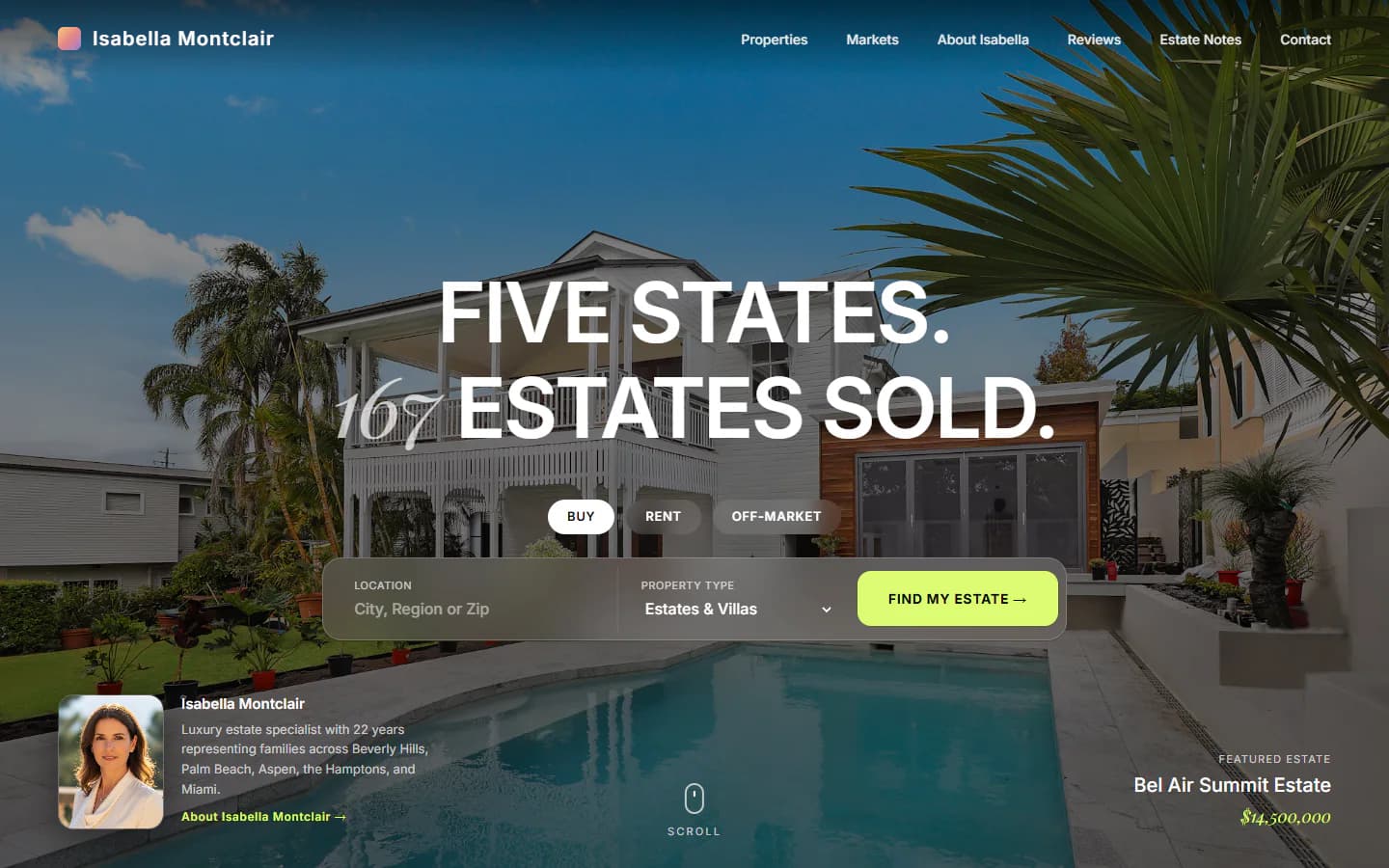
Overview
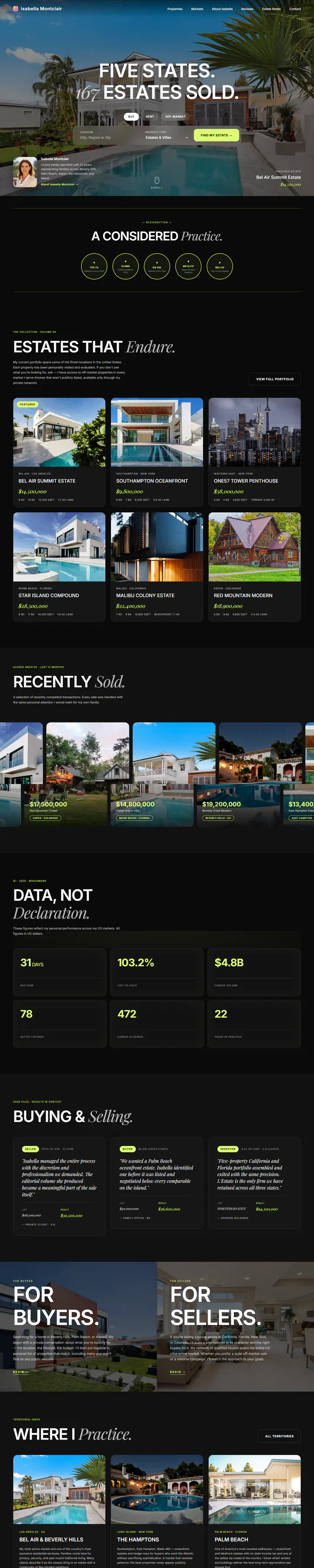
A near-black site for a luxury estate specialist. One full-bleed photograph opens the page with a Buy, Rent and Off-market search built into it, and the rest is a collection, a strip of sold homes, market figures and a buyers and sellers split.
What is on the page
- Search bar with Buy, Rent and Off-market tabs sits on the first screen
- Estate collection cards plus a scrolling strip of recently sold homes
- Properties index with Collection, Sold and Off-market tabs, grid and map views, and market, price and bedroom filters
- Separate pages for client reviews and written market notes
Color and type
- Ink#0A0A0A
- Surface#161616
- Lime#DCFC74
- White#FFFFFF
- Coral#E68884
- Headlines and interface
- Inter
- Italic accent
- Playfair Display
Design decisions
One loud color, used for actions only
Lime is kept for buttons, filters and small labels. On a page this dark, that makes the next step obvious without a second accent competing for attention.
Serif italics for the human words
Each headline pairs heavy sans capitals with one italic Playfair phrase, as in “A considered Practice.” It gives the page a voice without adding a color.
Photography carries the page
Every page opens on a full-width property photo under a dark gradient, so white type stays readable. Below it the page goes flat black and lets the listing images supply the color.
The same site at laptop width and at phone width, captured from the live demo.
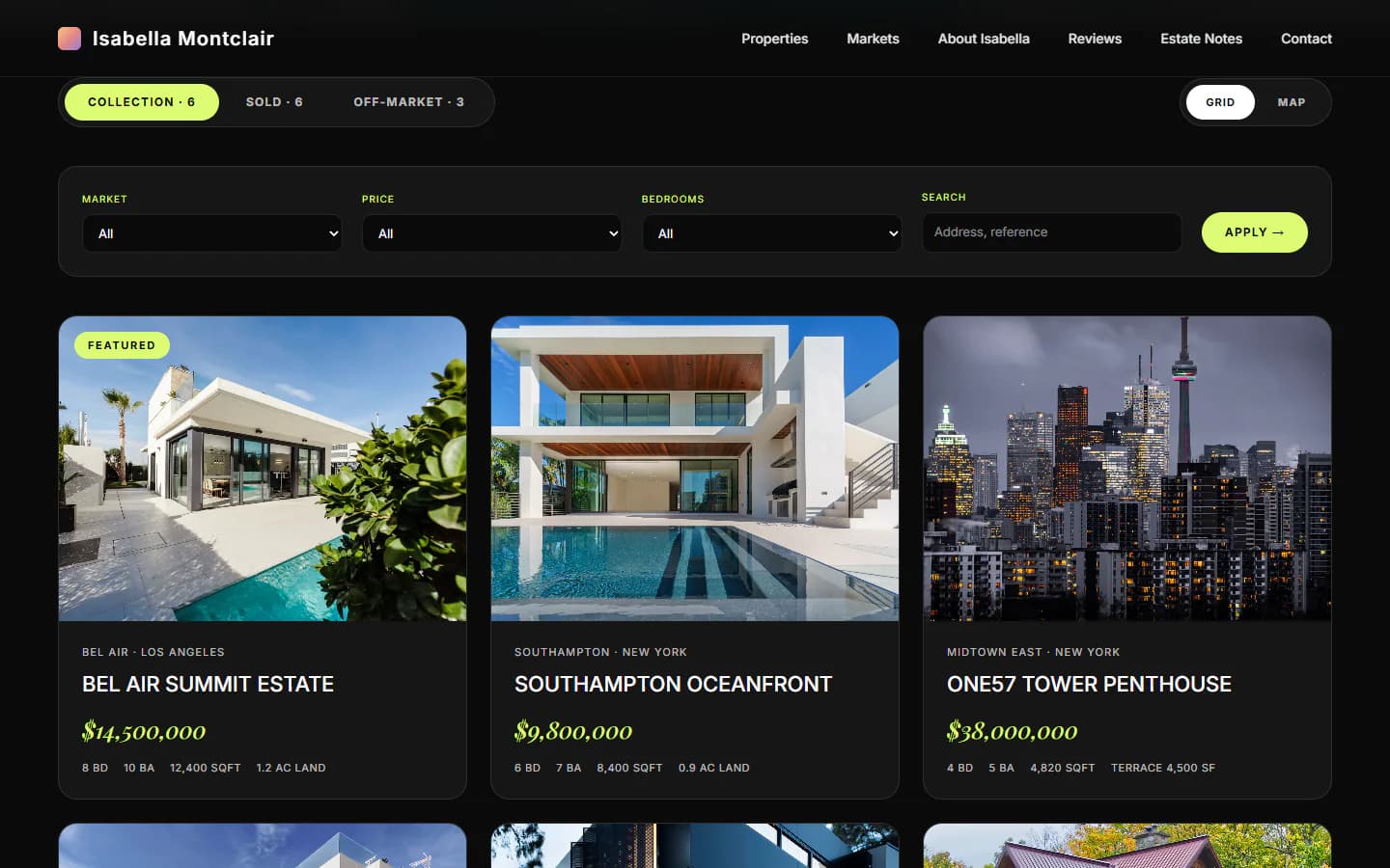
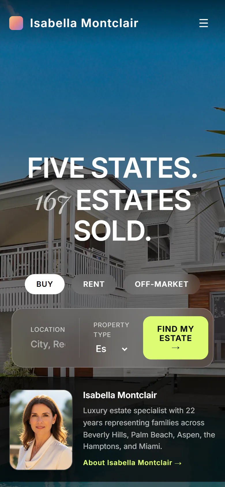
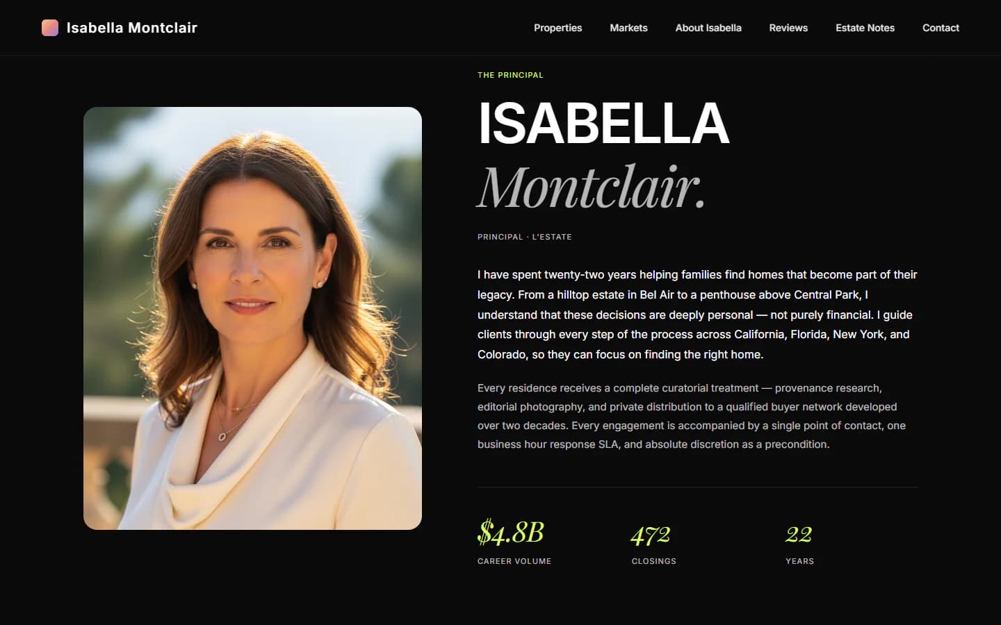
The full home page in one long capture, moving as you scroll.
Next project
Loud orange, editorial type
- Bold
- Editorial