Overview
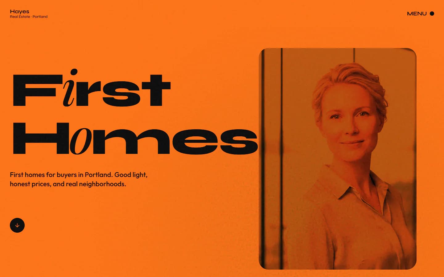
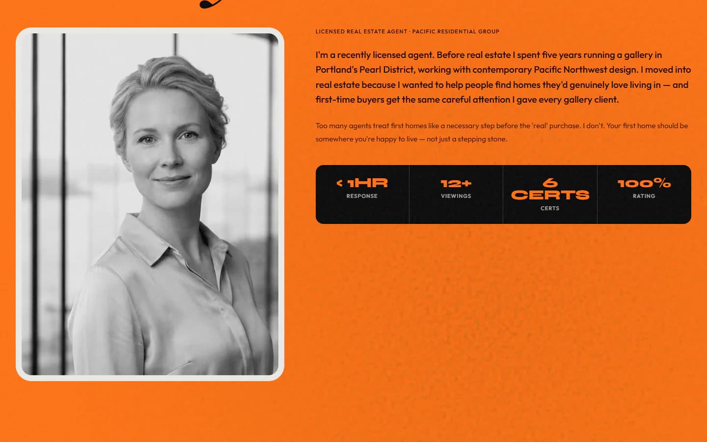
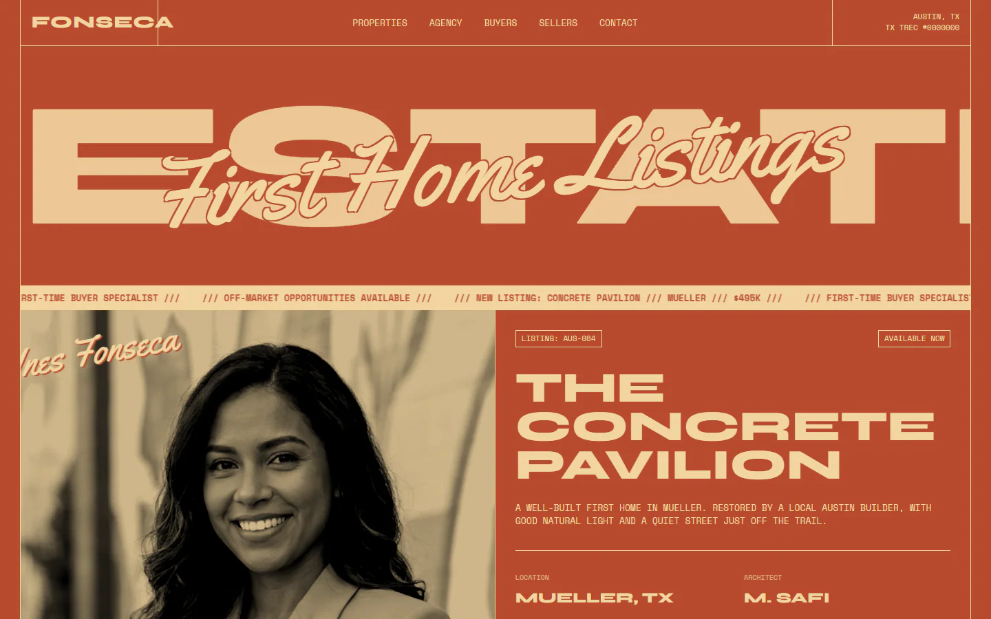
An orange-first site for a first-time-buyer agent. Wide Syne headlines swap one letter in each word for an italic serif, the portrait is printed in orange duotone, and sections change background color instead of using boxes.
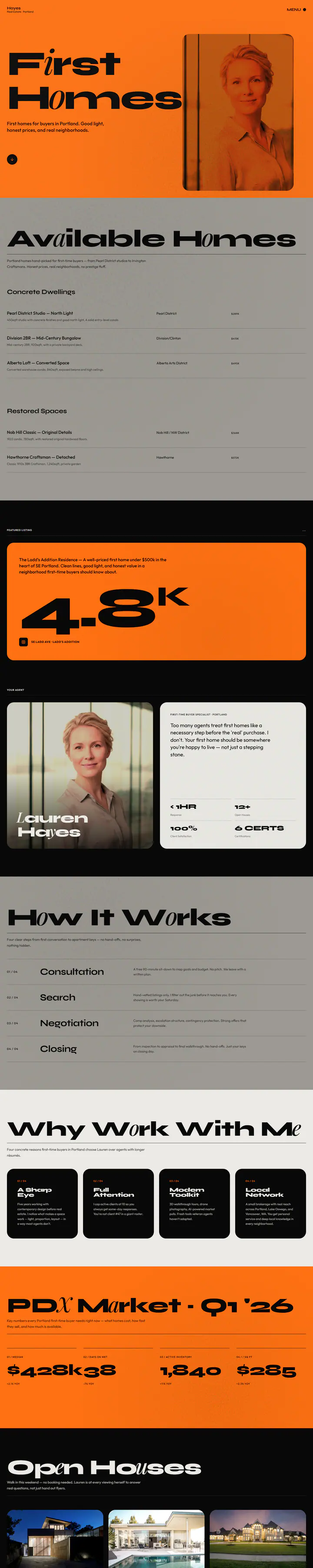
What is on the page
- Hero headline beside a portrait tinted in the brand orange
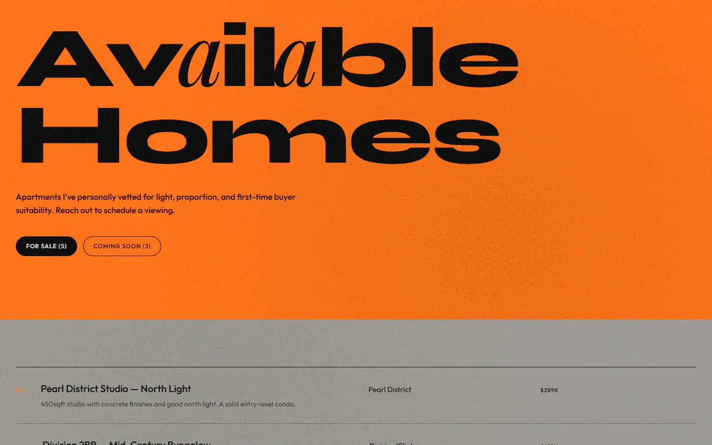
- Listings laid out as an editorial index, grouped by type rather than in cards
- Featured listing on a black band with one oversized figure
- Full-screen orange menu, plus an open-house strip near the footer
Color and type
- Orange#FF7113
- Black#080808
- Bone#EBEAE5
- Stone#9C9993
- Display
- Syne
- Body
- Outfit
- Italic accent letters
- Playfair Display
Design decisions
Background color does the dividing
Orange, stone, black and bone bands separate the sections, so the page needs very few borders or cards to feel organized.
A serif letter inside a sans word
One italic Playfair character per headline word breaks up the wide, flat Syne capitals. It is a small, repeatable detail that makes the type feel handled.
Grain over the flat color
A faint noise layer covers the whole site at low opacity, so large areas of solid orange read as printed rather than as a screen fill.
The same site at laptop width and at phone width, captured from the live demo.

The full home page in one long capture, moving as you scroll.
Next project
Two-color print poster
- Bold
- Editorial