Overview
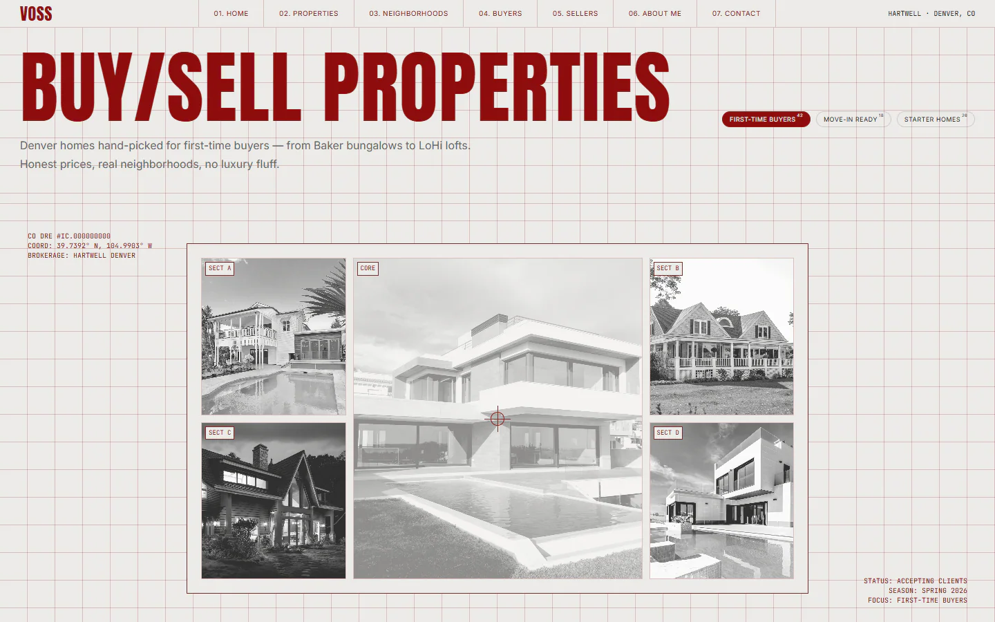
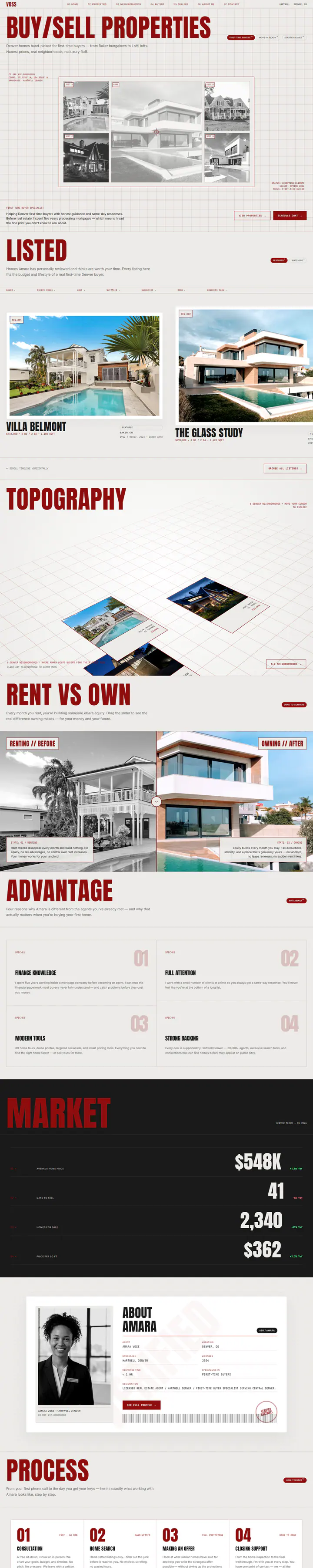
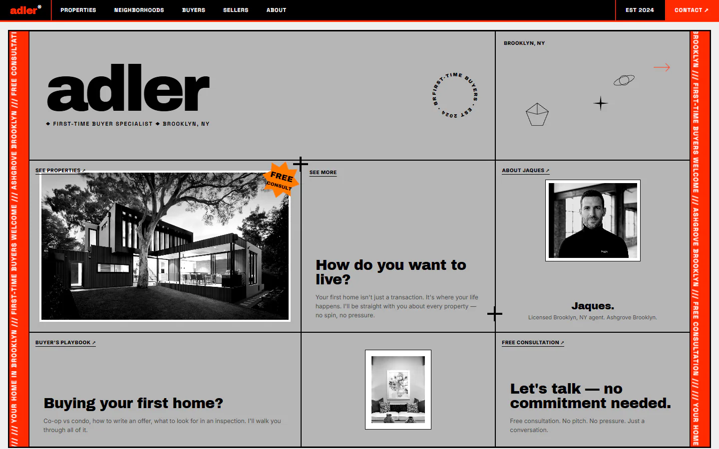
A site drawn like an architect’s sheet: a fine red grid behind everything, a condensed Anton headline, coordinates and reference tags in mono. It adds a rent-versus-own slider, a tilting map of neighborhoods and a dark market panel.
What is on the page
- Hero mosaic of five grayscale photos with a crosshair and survey-style labels
- Rent versus own: a before and after slider that compares the two
- Neighborhoods as floating tiles on a tilted plane that follows the pointer
- Dark market panel with figures and year-over-year change
Color and type
- Bone#ECEBE8
- Oxblood#8E0D0D
- Deep oxblood#6A0909
- Ink#1A1A1A
- Gray#666666
- Display
- Anton
- Interface and body
- Inter
- Labels and data
- JetBrains Mono
Design decisions
A grid you can see
Hairlines in a tint of the brand red run behind every section. Content snaps to them, so a very large headline and small mono labels still feel aligned.
Grayscale photos, red as the only color
The hero photos are desaturated, which leaves the oxblood type and rules as the only color on the first screen.
Explain the decision, not just the house
The slider and the process lists teach a first-time buyer how renting and owning compare, so the site works as a first conversation as well as a listing page.
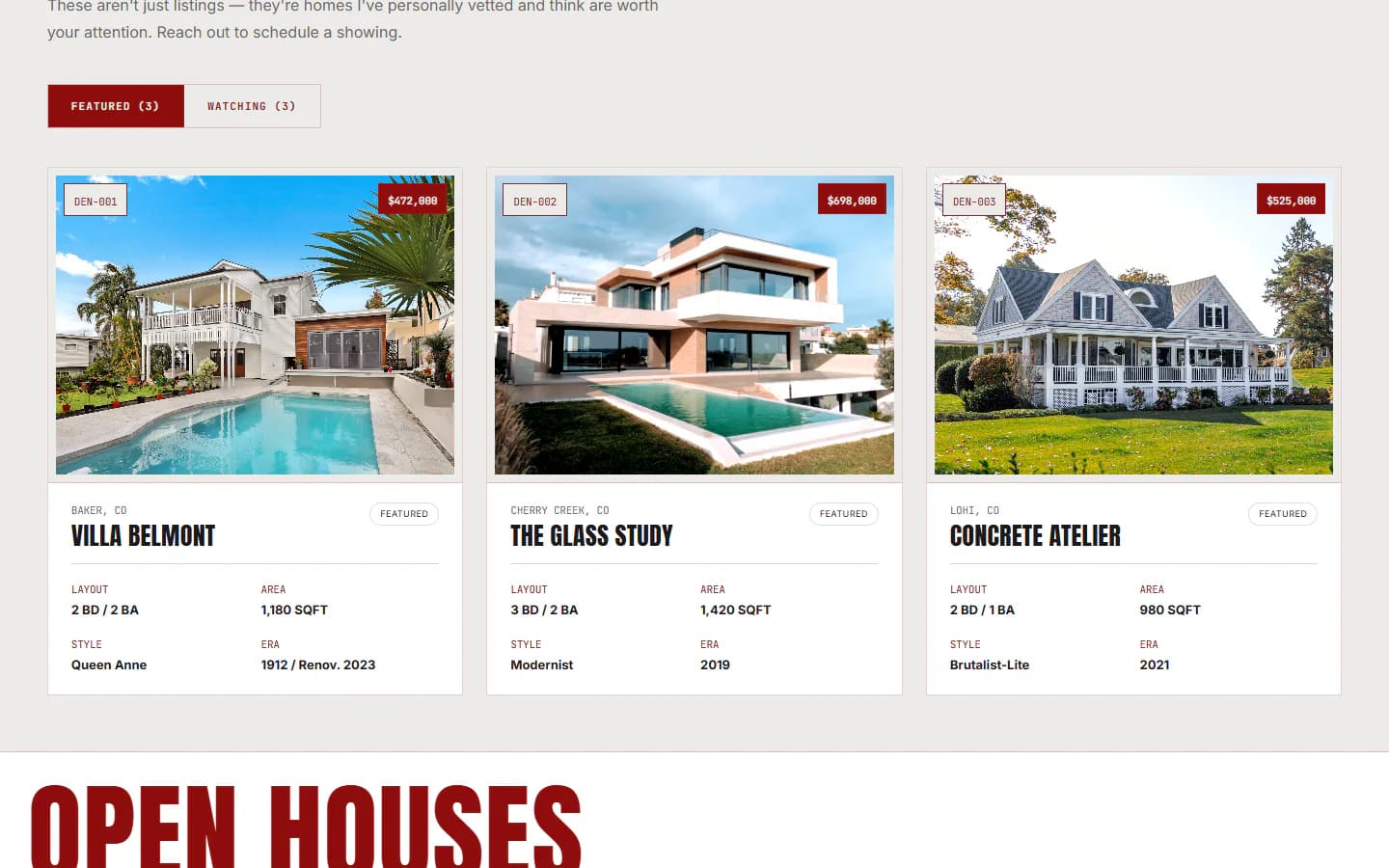
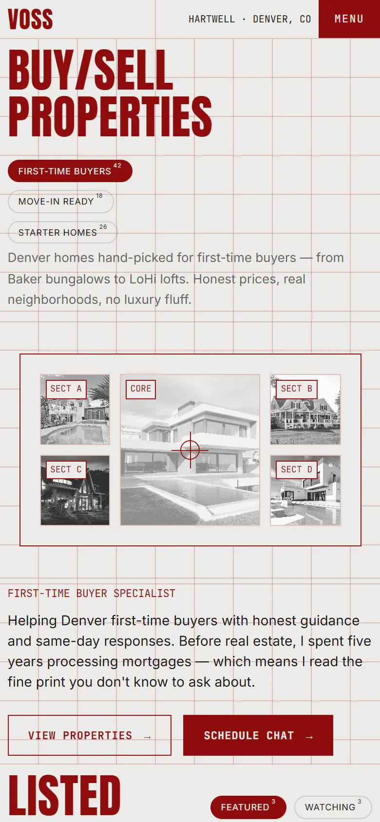
The same site at laptop width and at phone width, captured from the live demo.

The full home page in one long capture, moving as you scroll.
Next project
Modular grid, signal red
- Urban
- Bold