Overview
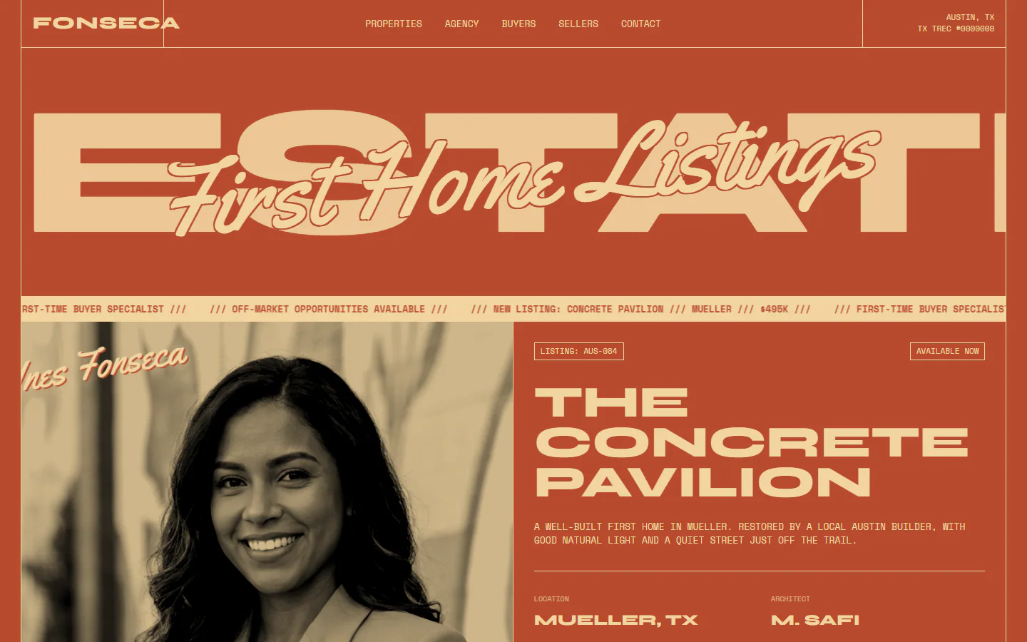
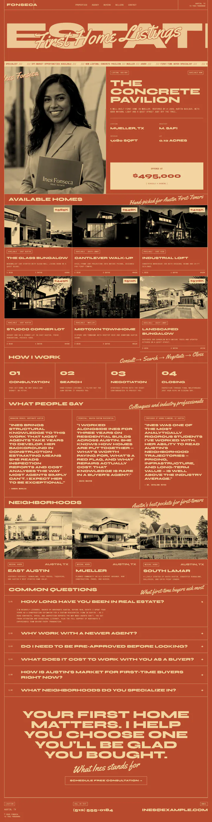
A site that runs on two colors, clay red and cream. An oversized headline word bleeds past the frame, script lines sit on top of it, and every listing photo is turned grayscale and pressed into the palette.
What is on the page
- Scrolling ticker under the hero and a featured-listing panel beside the agent portrait
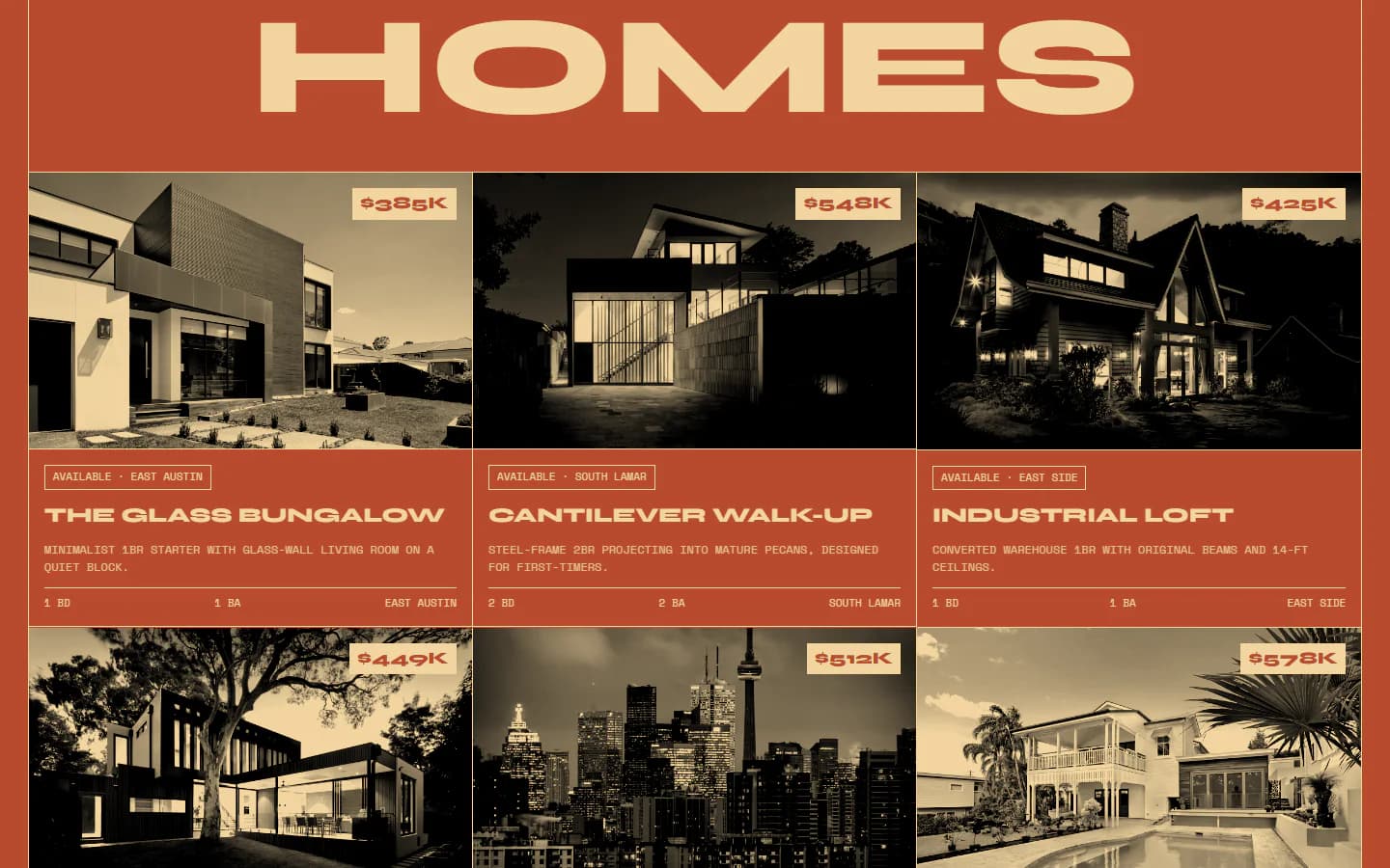
- Six-listing grid with price tags on each photo
- Four-step “How I work” row, three testimonials and a six-question FAQ
- Neighborhood cards for the three areas the agent works in
Color and type
- Clay#B84A2E
- Cream#F2D5A0
- Display
- Syne
- Labels and body
- Space Mono
- Script accents
- Yellowtail
Design decisions
Two colors and nothing else
Clay and cream are the entire palette. Photos are grayscale, contrasted and blended into the ground, so listing images take on the brand instead of fighting it.
Type first, then the human line
The first screen is a giant Syne word with a script line laid across it. The script handles the personal voice, such as “Hand-picked for Austin First-Timers.”
Hairline grid as structure
A single cream rule frames the header, cells and footer, which gives a loud page a clear skeleton and a print-layout feel.
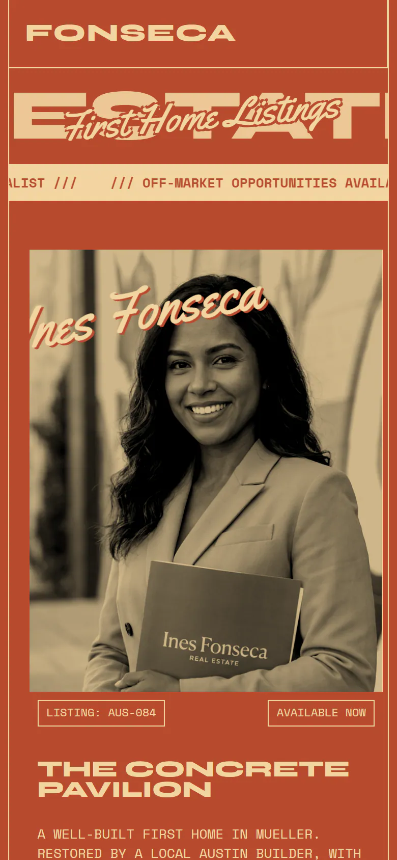
The same site at laptop width and at phone width, captured from the live demo.
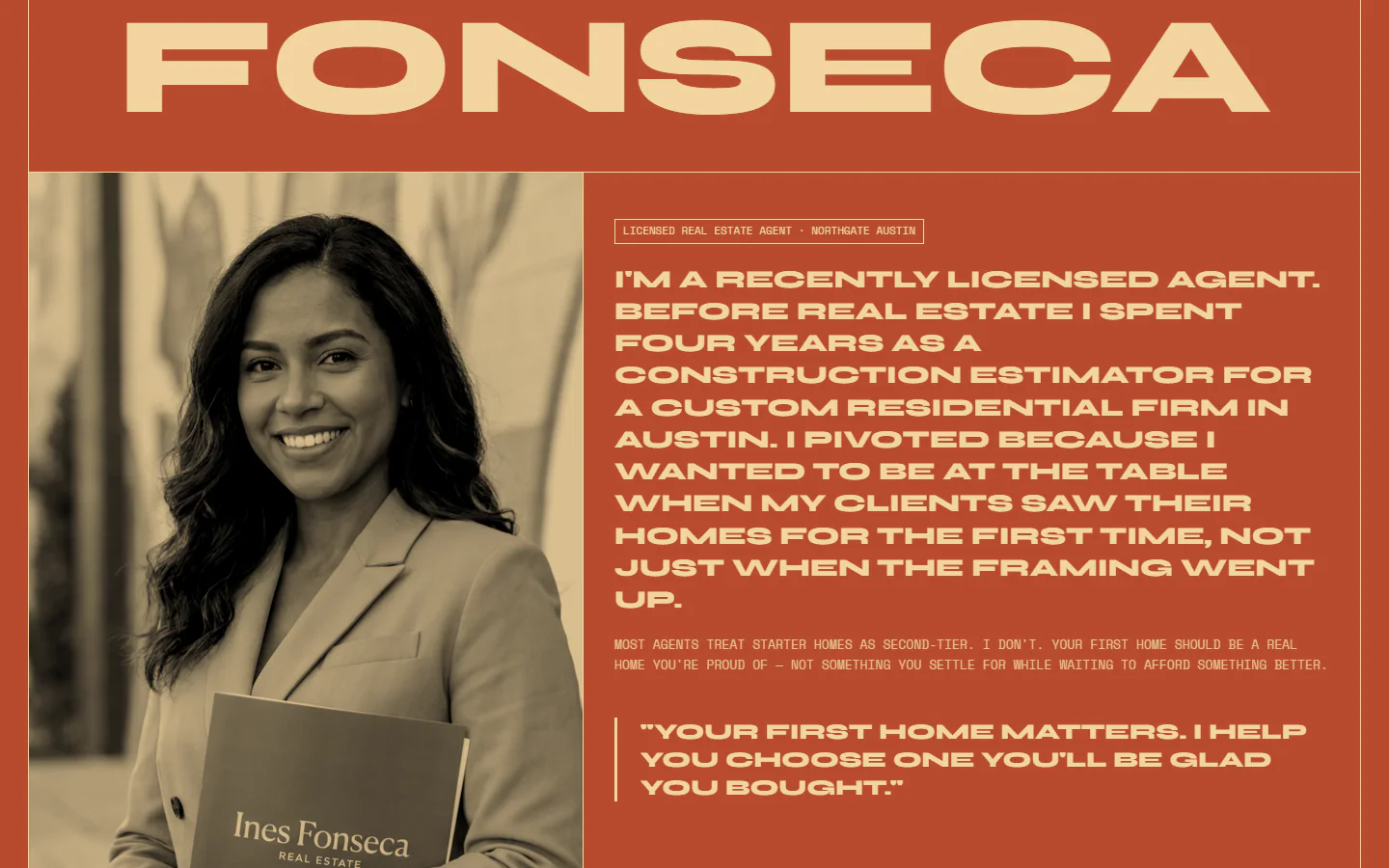
The full home page in one long capture, moving as you scroll.
Next project
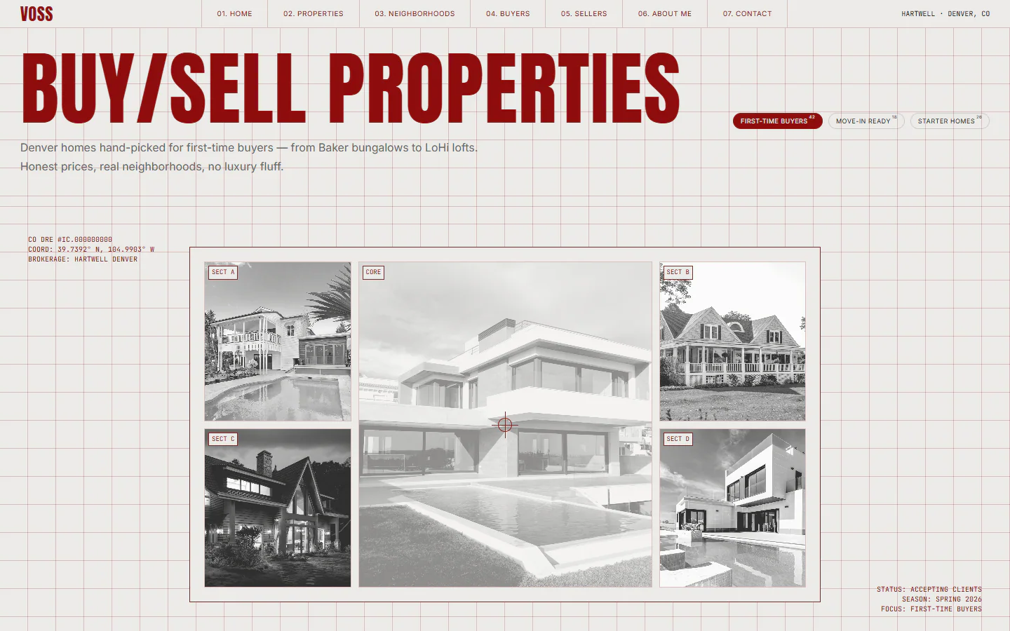
Blueprint grid, condensed red type
- Modern
- Urban